Search This Blog

Saturday, February 5, 2011

Kitchen Inspiration

Well, it's officially a stinker here in Sydney today! I was determined to do, and really looking forward to, my Saturday morning Zumba class... until I went outside to hang up the washing. Then I retreated inside, closed all the blinds and windows, and turned the fan up. It's only 10am but I'd say we've probably hit 40C already...

So, turning thoughts back to interior design, I've spotted some inspiring kitchen pictures. Although I'm going to do one of those 'integrated', modern-style kitchens (because it will be part of an open-plan living/dining area and I don't want the kitchen to dominate in any way), I do quite like these American decorative-style kitchens. They're still simple and clean looking, but maybe a little more grown-up and elegant than slick/minimalist-style kitchens? What do you think? If I had a whole room/separate area devoted to the kitchen I think I'd be tempted down this path... or are they too fussy and girly? Hmmm...

This is an India Hicks kitchen - beautiful light fittings.

This is a good interpretation of the above look, but done on a budget. Note the same light fittings? Check out Made by Girl for more pics of this reno, and the one below.

Again, great  light fittings. They make such a difference.

I love open shelves, but let me tell you, they are not practical in the kitchen! Trust me, I have them now. Everything gets covered in a special greasy type of dust (even when not directly near the stove).


They do look nice though, don't they? Love floating shelves in particular.

I guess I must be a pragmatist, because I love a tile spashback like the one above, but I immediately think of all the tomato puree that will end up splashed in that nice, white grout... I think it will be boring old glass for me...

This is such a cute, feminine kitchen. Not sure about the limestone floors with this look, but it manages to have real character, which is hard for a kitchen that's obviously quite new. 

Enjoy the weekend! x

Tuesday, February 1, 2011

Renovation Progress!

Well,  our renovations were meant to be in full-swing by now, but we only received the plans in the mail yesterday. Exciting nonetheless!


And in another coup, Tom finished the lights in the common area. Here are some before and afters:

This is the foyer when it had PINK CARPET (note the pretty girls - my nieces, who were also my bridesmaids). This is the only photo I could find before we changed the carpet.

This next one is after we re-carpeted. We took a vote in the building regarding carpet colour choice, and 'Donkey Grey' it was (does that strike anyone else as a slightly sexual colour name?)! We didn't have plans to do the lights at that stage, but seeing that we had only re-painted a year before, lighting seemed like the only thing missing. Note the dodgy little light fitting.

And this is the foyer, re-painted, re-carpeted and 'dressed up' with the art-deco style light fitting. Voila!


This is the fitting all lit up. Having 5 bulbs, rather than 1, provides so much more light in the foyer. Tom has put the building lights on sensors too, making it much more eco-friendly and safe. There's now no need for the house lights to stay on all night long, because as soon as anyone exits their apartment, or enters the building, they turn on. Cool, hey?


These were the old wall lights.

These are the new wall lights, which match the main light fitting (they are all in the ground floor entrance area). The new wall fittings have revealed a little area of uneven plaster, but it's hardly noticeable in real life and can be easily taken care of next time the building needs to be painted.

Next on the agenda for the building is to have the front garden and pathways newly landscaped. So as our own renovations progress, there will be more to report on for the building too.

Details:
Walls - Dulux Antique White USA
Ceiling - painted in a flat ceiling white
Carpet - 100% wool, 'Donkey Grey'
Light fittings - Pearl Lighting and Brassware, Willoughby (Sydney, Australia)

Thursday, January 27, 2011

Bookshelves & Study Nooks

If you have a decent collection of books, as most people seem to, you're going to need some kind of bookcase or shelves. We currently have an Expedit bookcase from Ikea that's pretty chock-full of books (below), but we'll have to get rid of it when we get our built-in wardrobe installed in its place.


We don't really have space to put a bookcase anywhere else in the apartment. But I've come up with a solution.


See that little wall protruding next to the dining table? Our engineer told us that we can't remove it as part of our renovations, so it's here to stay. And it's actually 600mm wide. And see the laptop on the dining table? Nowhere to put that either.

So, I've decided to install white floating book shelves on the protruding wall, right up to ceiling. The ceilings are about 2.7m high, so we should hopefully fit most of the books that are currently in the Expedit. I'll make the first shelf desk-height to house the computer, so we'll just pull up a chair from the dining table when we need to use it, and voila - a study nook! Up there for thinking.

It will probably look something a little like this. Now if only our builder would get his act together...

Here are some pictures of bookshelves and a study nook that I came across in my travels:

There's even a resident pug on the couch (although ours is black)! See how striking the dark background is against the books? Ooohhh can't wait to paint!

Bookshelves between the fireplace and the wall - a great use of space that would otherwise probably go unused.

A staircase that is also a bookcase/library, with steps wide enough to sit on. Possibly one of the coolest ideas ever...

Elegant, floating cube shelves.

This study nook is part of a kitchen, like ours will be, only on a much grander scale!

Wednesday, January 26, 2011

Australian Abstract Painters

I'm one of 'those people' who really like abstract art. Good, abstract art mind you. One of my favourite artists is Dale Frank, an Australian painter. Frank's works also have an element of surrealism:

If I was seriously cashed-up, I'd definitely buy one of these (much to my husband's outright horror - we have totally different tastes when it comes to art!)

I think I'm just a sucker for really large works, with absolute colour saturation, and these paintings give me that in spades. Plus, Frank has the funniest names for his works, like 'No matter how little he ate he always remained persistently bloated.' Love it.


I also like Ben Quilty, although some of his paintings are a little heavy, or disturbing. I still appreciate them, but I'm not sure I could live with the more confronting ones. Love the budgie though.

Sunday, January 23, 2011

Happy weekend! Architectural tour of Seven Shillings Beach, Double Bay, Sydney


Well, like any good renovation, ours is experiencing delays. So delayed in fact, it's yet to even start.

Our builder was meant to have the plans to us to sign a few weeks ago. Until we sign them, they can't be submitted to council. With this delay, we're probably looking at a start date in late-February at the earliest! I'm not very good at being patient. And of course there's no 'before' and 'after' photos to put up here yet either - sorry.

Not only is our own work delayed but my husband, Tom, is replacing all the existing light fittings in the common areas of our our art deco apartment building and this has also been delayed! The lighting shop didn't give us all the right parts and one of the wall-light fittings was bent. The main fitting is up in the lobby and looking lovely, but needs to be weighted so that it doesn't lean to one side. So, hopefully now that the missing components have arrived, everything will be fixed soon and then we can upload some photos!

In the meantime, I've just got a new iPhone 4 that I started playing around with yesterday. I thought I'd put up a few photos of Seven Shillings Beach, Double Bay where my husband, niece and I went for a swim yesterday. For all you non-Sydneysiders, this is only a few short kilometers from Sydney's city center, and has a lovely harbour pool called 'Redleaf'. There are also some private properties that back onto the beach, both old and new. In the interests of 'seeing how the other half lives', here's a little architectural tour...

 This is Redleaf Pool, at one end of the beach - great spot for a weekend dip!

 This is facing the other direction (away from the City).

Same view with a hypstamatic lens.

 A 1920's block that looks like it's had a recent adjustment with the addition of balconies. I'd say that the top, red-brick part represents the original exterior.

Same building with a hypstamatic lens, also showing the original boatshed.

This looks like a 1970's block to me - all crisp lines and boxiness. Normally I am not a fan of 1970-80's brick buildings, but this is an exception. Somehow it looks fresh and nautical. The white rendering and dark blue awnings help make it 'fit' in its harbourside location.

Same building, looking up.

This a modern house, probably built in the late 1990's or early 2000's.  I would call this particular style 'Bunker' because it looks like...a bunker. Interesting that the older buildings house multiple residences, while the more recent additions are large stand-alones...

This old building is set so far back from the beach in private gardens, you can only jut see the top of it (you can see more if you click on the photo)... that's a gorgeous old magnolia tree in the front, left. It looks around Federation-era to me.

I'm not sure if this is Federation or Victorian era, but it's been converted into apartments. Again, set well back from the beach in extensive private gardens.

This is the cutest little boat shed at the end of the beach. I think I'd be quite happy living in there...

View from the beach toward the City. Spot the Harbour Bridge?

I think properties in the harbour-side areas of Sydney have a particular kind of aesthetic. It's interesting to see how the urban and natural environment influence the local building and decorating styles - lots of white, plantation shutters, polished floorboards (its also getting quite popular to paint these white too), modern aboriginal art, slick kitchens, balconies, fresh flowers, indoor/outdoor living, high ceilings...

It's interesting to see the difference in architectural styles that this one little harbour beach displays. I definitely know what I prefer, what about you?

Tuesday, January 18, 2011

Amazing paint

It's truly amazing what a coat of paint can do. If you don't believe it, check out the pictures below from my favourite wholesome, American blog, Young House Love:

Before


After


Just had to share because what they've done here is so simple, but so effective. As far as I can tell, they've just removed the poky little folding doors, added a mirror, and painted the trim white and the walls in a nice contrasting colour. Voila!

Just a short post tonight. x

Sunday, January 16, 2011

Art and alternatives

I love art.  It can lift your mood, reflect who you are, and inspire you. And it totally transforms a room - I don't think there's such a thing as an amazing interior with blank walls (well, unless you're an ultra minimalist, but even then...)

But good art is normally expensive (as in, thousands and thousands). I'm lucky to have two large paintings by recognised artists, neither of which we paid for, mind you. I'd really like some more, but after our renovation I don't think there's going to be an 'art budget'! So what's the alternative? Well, I've been looking and there are heaps of really cool ideas for walls including mass photo displays, decals, paper garlands, tapestries, blackboard wall-stickers, mirrors, word press pieces, prints, vintage posters, and vintage maps.

Etsy is a great source of original art, plus prints and posters, often at really reasonable prices. And with the Aussie dollar this high, it's a good time to make a purchase...


I think these vinyl wall stickers at Urban Walls look really effective, with a similar effect to wallpaper. US$45 for 8 pieces.


This is an original 19x15cm oil painting at 'dailyportrait' for US$275. This shop also has lots of original sketches around the US$50 price range. The artist drew a portrait a day for a year, which is chronicled on his blog, and the results are up for sale at this Etsy shop. Cool, huh?


Dr Kennedy Jones' shop on Etsy has quite a few whimsical, retro-style prints around the US$30 mark. The obvious place to use them would be a kids' room, but I think they'd work equally well in a bedroom.


Letters - a little trite now, but essentially still a pretty cool idea. These ones are US$75 at William Dohman


An understated but fun print from Made by Girl (US$12.75).


If you like fashion illustrations, have a look at silverridgestudio. I love these colours - very moody ($US75, Glicee print).


Cute word-art (US$25 at dazeychick).


Gotta love the colour saturation (US$24 'Pink Triangle' print by twoems).


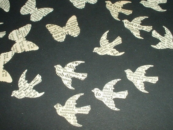
200+ birds cut out from old dictionaries for US$3.00 at LoveTspVintage - just imagine the possibilities! Also airplanes and butterflies available. So cheap you could order, like, 900 birds and just roll around in them...


Large, vintage maps can also be displayed as art. A world map would be great in a lounge room (this one is US$275 at Vintage World).


Well, I could definitely keep going in this vein so I'm thinking, look out for 'art and alternatives' episode #2...